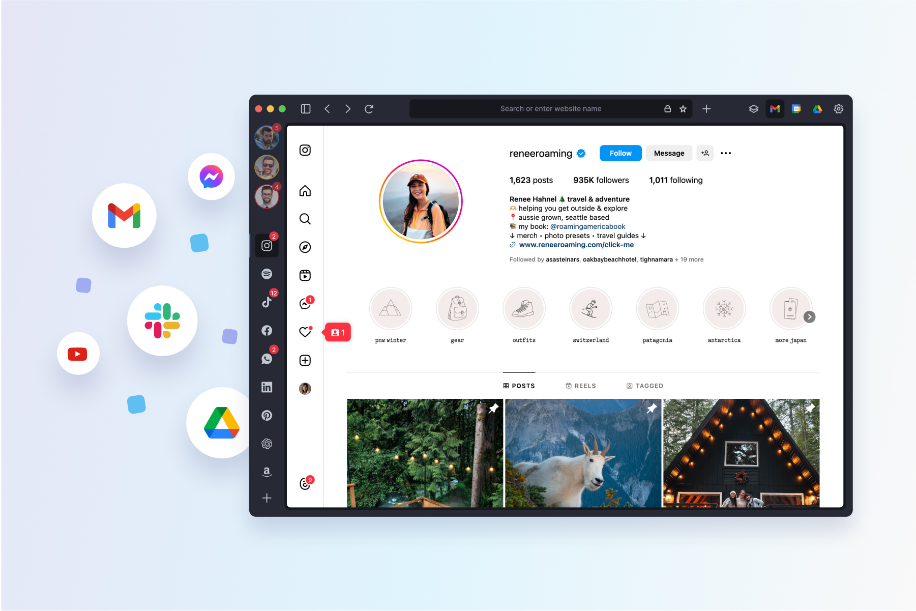
Jumping back and forth between email accounts. Scanning through dozens of tabs in search of that one story you started reading a week ago. Switching between apps again… and again… and again. Exhausting, right? As much as the internet has evolved to broaden and improve our online lives, we’re still stuck paying an invisible “toggling tax” that slows us down, distracts us, and erodes our control of what we do online.
How much time does the toggling tax cost us, exactly? It’s a lot more than you may realize: In 2022, the Harvard Business Review found that people switch between apps and websites nearly 1,200 times each day, at the cost of two seconds per switch—which adds up to a whopping four hours a week wasted on hopping between the many aspects of our online lives.
The toggling tax isn’t just paid in time, either. Constantly moving back and forth online is a type of context switching, which puts a heavier cognitive load on our brains as we adjust to each new task. Context switching has been found to raise levels of the stress hormone cortisol, making it even harder to focus. “When people think they’re multitasking, they’re actually just switching from one task to another very rapidly,” MIT neuroscientist Earl Miller told the Guardian. “And every time they do, there’s a cognitive cost in doing so.”
But we don’t have to pay the toggling tax. A new generation of web browsers promise to streamline the online experience—none of them more innovative or intuitive than Shift, which centralizes every facet of online life into a single window. Shift’s mission is simple, according to VP of Product and Customer Success, Michael Foucher: “We create calm out of tab chaos.”
The rapid evolution of the power browser
Shift was born from an all-too-familiar predicament. Back in 2016, Foucher was using multiple email accounts all the time, but no single browser could quickly and easily switch between them. He had to cobble together a common makeshift solution. “I would have one account open in Chrome. I’d have another open in an incognito window of Chrome. I’d have Safari open and another incognito window of Safari too,” he recalls. “But it was untenable, so I started thinking about what a real solution would look like.”
That search led Foucher and his team to develop Shift, which officially launched as a subscription-based browser built on Electron in December 2016. They quickly found a devoted customer base, whose feedback and product requests sparked growth and innovation over the next eight years: Shift saw 10X ARR in 2018, 5X ARR in 2019, and more recently, launched an ambitious rebuild on Chromium to boost speed, security, and user experience.
Today, Shift seamlessly integrates over 1,500 apps for ultra-fast access to all the tools that people need to stream, shop, work, browse, and stay connected online, eliminating the need to search, open, and log into accounts across multiple windows and tabs. And user feedback continues to play an essential role in development. Foucher talks to a dedicated group of customers on a regular basis to understand how Shift saves them time and improves their browsing experience. By allowing people to tailor exactly how they navigate and organize each facet of their online lives, they’re using Shift to massively cut down the toggling tax.
Simplified, centralized, customized UX

Here’s how it works: Shift anchors your customized Workspaces in the left side of the browser window that can be connected to email accounts including Gmail, Outlook, or Office 365, each Space can be customized to the stream of online activity through integrating your most used apps “We created a mapping that is easy for people to pay attention to,” Foucher says. “We’re lowering the cognitive load required to keep track of what you’re doing online.”
Compared to legacy browsers, Shift offers an unparalleled degree of customization for integrating web apps, managing email and notifications, and even tailoring Workspaces for focused browsing. There are a lot of basic, generic browsers out there. Some of them can be reliable, but none of them can be tailored to your needs so specifically that you’ll feel that you can never live or work without them. That’s what makes Shift so unique.” Unlike other new browsers, which tend to be technically powerful but difficult to learn and use, Shift is meticulously tested to be as approachable and intuitive as possible.
That commitment to an intuitive interface has driven a number of innovative product features, such as a unified calendar that displays every event across different accounts within a single pop-out panel. What’s more, when Shift wants to push visual changes to its product, it can do so much faster than most projects built on Chromium because of how its interface is built. “We’re very nimble—and that makes a massive difference,” Foucher says.
As a portfolio company of the Redbrick family, Shift is now looking to the future to improve its browser even more. What’s coming up on the horizon? Foucher can’t reveal too much about what they’re innovating, yet. What he can say is that they’ve begun leveraging AI models to solve daily human pain points. Whatever the feature, he promises that Shift will be laser-focused on alleviating tab chaos and making it easier to be online, because that’s what users need and want.
“I never want to release anything that would force the user to go find help to figure it out,” he says. “The user should always understand exactly what they’re doing. That’s our sweet spot.”


